15 Ways to Enhance Your Healthcare Facility
Healthcare facilities tend to have large campuses with multiple departments. Even smaller practices have different departments or are part of a larger shared complex or parking area. Patients and visitors depend on clear signage that clearly directs them where they are trying to go. Mediocre signage can not only cause a negative experience for visitors but also impacts operation and workflow for staff.
Create a system that works for your facility with these signage-related tips that strengthen your brand, safety, and direction.
15 Ways to Enhance Your HealthCare Facility with Wayfinding Signs
#1: Roadside signage
The first point of contact is the signage that is street-facing. A distinguishable monument confirms the location and presents your brand. Use this as an opportunity to distinguish your brand identity from the get-go.
#2: Building side signage and monuments
Be sure to include building signage or monuments that are distinguishable, that way; you can easily guide visitors with this visual cure.
#3: Exterior directories with clear distance and direction
Be sure to include directories with clear arrows and distance that are viewable to traffic into your complex and parking area. This is paramount when you have multiple entrances or buildings.
#4: Path signage with clear direction
Walking paths with a series of signs from the parking lot to the door are helpful to your visitors and act as a check for them to confirm that they are heading in the right direction.
#5: Use frequent signage
Reassures visitors that they are on the right path or allow for reorientation as they move through your facility.
#6: Maps for ease
Place maps at convenient areas such as major junctions, on key routes, and in high traffic areas. Maps that are clearly labeled are highly effective as they provide an overview of your facility.
#7: Floor graphics
Floor graphics are a fun solution to get people precisely where they need to be. Floor graphics can be easily changed out as your needs change.
#8: Interior directories
Interior directories keep details of offices or departments all in one place. Place an interior directory at an entrance or lobby.
#9: Seize the opportunity to say more
Use themed signage and graphics to distinguish regions and show people your culture. A pediatrics department may want to set a more playful tone to ease its young patients, whereas a dermatology department may want something more bright and airy.
#10: It’s all part of one system
Remember signage from monument to directions to the bathroom is part of an integrated system. Do not discount the importance of these details.
#11: Design for All
In addition to ADA Compliance, inclusive design principles establish accessibility of information for all. If needed, have signs presented in multiple languages and at eye level for visitors in wheelchairs or motorized devices.
#12: Include graphics
Graphics supplement written directions and communicate information more quickly especially for visitors that may not have english as their primary language.
#13: Maintenance
Evaluate signage that isn’t working. Where are people getting lost? Has anyone complained about any particular area?
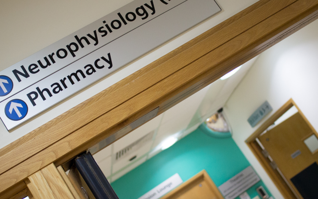
#14: Consider the language used
Medical terminology may sound like jargon to visitors. Instead of signage labeled “ophthalmology” use “eye care”. This ensures that you meet the needs of the widest range of users.
#15: Be mindful of your brand
Though your signage should always be clear and simple, it must also promote who you are and what you do.
Contact us at 402-339-6856 today for a signage system that enhances your brand as you help your visitors navigate your facility.