Sign color combinations are critical. And contrast is an essential element in to sign legibility.
You would think this is a no brainer, but sometimes that seem to differ. Along side the road, we’ve seen color combinations of black and blue and orange and yellow. We don’t ever really see the message. It’s lost in the design!
Our graphic designers help clients be mindful choice in color. We suggest you choose one very dark color and another very light color. Some colors that go well together are as follows:
- Black and white
- Blue and white
- Red and white
- Green and white
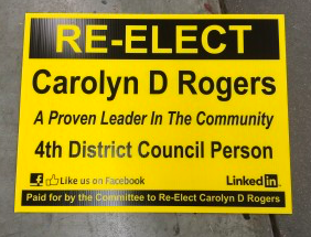
- Yellow and back
Keep in mind some people may be color blind. It’s best to avoid similar colors that may cause confusion like blue and green or yellow and green. If you’d like to use two similar colors, consider making them contrast more. This can be done by adding a shadow or outline to the shape. It not only adds visibility, but creates a bolder image.
Related read: How to Use Color Blind Friendly Palettes to Make Your Charts Accessible
Lastly, keep in mind the color of the material you are completing your project on. If you are using a white background, it’s easy to pop on a bold blue or robust read to create an impactful image.
Our family owned business has been around for more than 30 years. We are the leading experts in signs, banners, decals, and magnets! Get your message out by giving us a call today. We’d love to help help you choose your sign color combinations for your next project.