People are affected psychologically by the colors presented to them in advertising promotions. One of the first considerations in choosing the right color combination is the level of visibility that will be created.
By contrasting a light color font or graphic on a dark background or a dark font or graphic on a light background, viewers will be more drawn to your signage. Fonts should be legible and uncomplicated. The background or graphic should never overpower or distract from the actual message of the sign.
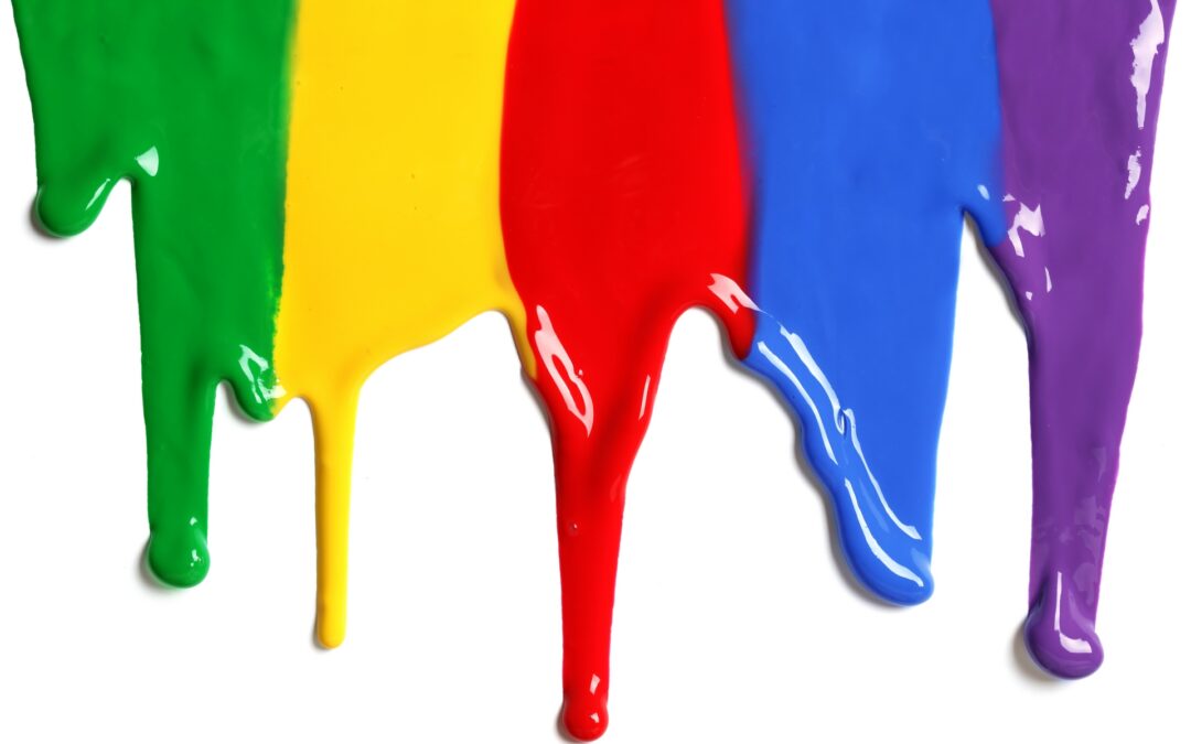
Since people react psychologically to various colors, you should choose the shades that most closely identify with your business or company theme. Warm colors tend to encourage people to feel comfortable enough to relax and linger. If you want customers or clients spending extra time in your store or restaurant, you’ll want to pick from a pallet of colors that have comforting layers of reds, oranges and yellows in them.
If you want your signage to be a real attention getter, yellow is a universal favorite. You can pick a signature color such as hot pink or electric green. Strong reds and blues are always popular choices.
The following examples show how companies have chosen colors to express the message of their unique products or services:

- Yellow (happy feelings) – McDonalds wants every meal to be a “happy meal.” By adding some fiery red, they have created a sign that functions as an appetite stimulant.
- Blue (business confidence) – IBM wants everyone to trust their products.
- Green (health) – Starbucks has a healthier, “greener” product.
- Purple (royal, mystery, wisdom) – Hallmark has the perfectly worded card for every occasion.
- Orange (joy, optimism) – “The world runs on Dunkin.”
- Pink (femininity, love) – Victoria’s Secret is all about romantic, sexy women’s fashions.
- For professionalism and elegance, black on white is always a good selection. In fact, a white background is a good choice for any strong contrasting color. Black serves the same purpose when it supports very light or bright letting or graphics. Other complementary choices such as the blue-orange combination that Tropicana has used or a purple-yellow pairing can be very effective.
Source: http://www.colorcombos.com/choosing-the-most-effective-colors-for-your-business-signage-article.html
nice to know this about colours